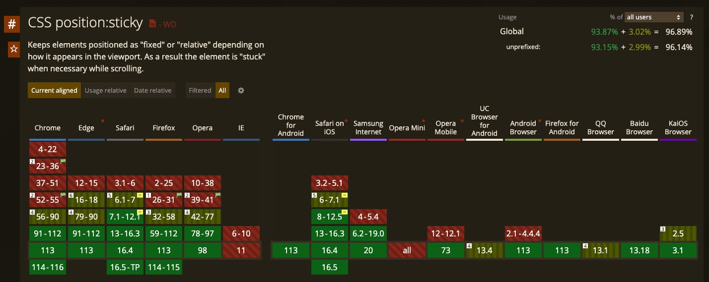
今天來介紹 position: sticky,首先來看看這個 CSS 的支援度(97%)
嗯…IE 不支援(沒關係,IE 不是瀏覽器,只是個相容性解決方案 by @tomwarren
來看看 position: sticky 的 MDN 文件 說明
The element is positioned according to the normal flow of the document, and then offset relative to its nearest scrolling ancestor and containing block (nearest block-level ancestor), including table-related elements, based on the values of
top,right,bottom, andleft.
簡單翻譯來說,被設定 sticky 的 element 會根據 scrolling ancestor 的 element 偏移 top, right, bottom, and left 的值。
來看個範例動畫會清楚許多:
比如有一個商品購物頁面,在頁面最下方有商品明細與金額的相關資訊,此時設計師希望
使用者捲動離開頁面底部時,可不可以把商品明細固定在畫面的底部,如以下範例動畫
再來我們實際看看程式碼,希望使用者捲動畫面時,可以把 footer(特定區塊) 固定在畫面下方
此時應用 sticky 就可以直接使用以下 css 達成
footer {
  position: sticky;
  bottom: 0;
}
Sticky 的小細節
值得注意的是 sticky 所謂的 scrolling ancestor 的定義,是有一些前提條件的
This value always creates a new stacking context. Note that a sticky element “sticks” to its nearest ancestor that has a “scrolling mechanism” (created when
overflowishidden,scroll,auto, oroverlay), even if that ancestor isn’t the nearest actually scrolling ancestor.
這段描述說的也就是,如果今天 position: sticky 的父元素,如果有以下的 overflow 值
-
hidden
-
scroll
-
auto
-
overlay
那此父元素則會成為 scrolling ancestor,但這會影響什麼呢?
讓我們繼續看看上面的例子,如果現在希望將 Left Content sticky 在畫面上方 10px 處
我們可以透過設定以下 CSS 達成
.content {
  position: sticky;
  top: 10px;
}
看起來一切運作正常,但如果此時剛好 content 的父元素符合上述的 overflow 條件
例如:
.left {
  // scrolling ancestor
  overflow: auto;
}
導致 content 的 scrolling ancestor 從 viewport 改為 .left,因此 sticky offset 則會參照 .left,所以結果上看起來就像是 sticky 不運作了。